Element Display
| Property: | display |
|---|
| Default value: | Inline |
|---|
| Inherited: | No |
|---|
How do you want your element to appear? As an inline element? As a block element? Or at all? Most elements are either inline or block, but there are a number of other values as well. The most common are:
- inline
- This causes your element to appear as an inline element. Several elements have this automatically, such as:
a, abbr, acronym, em, span, and strong
- block
- This causes your element to appear as an block element. Elements that have this automatically are:
h1 - h6, div, and p.
- inline-block
- This causes your element to appear as an inline element, but you're able to specify its size like a block element.
- none
- This causes an element and its content not to appear at all. Why would you want some content to remain hidden? One simple, ubiquitous phrase: print-friendly pages. This is often used with alternate media stylesheets, such as print media (remember that you may have a separate stylesheet for printing). On the screen, a navigation bar is invaluable. On the printed page, it's just in the way.
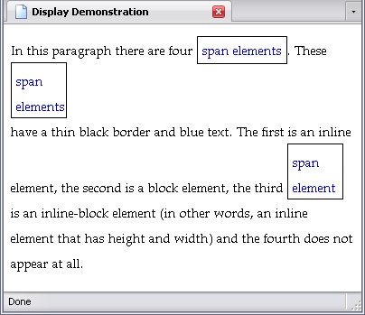
Below is a webpage with four span elements, one that is set as an inline element, one as a block, one that is inline-block, and one that's not shown.
body{line-height:2;}
span{
border:thin solid black;
color:blue;
height:50px;
width:50px;
padding:5px;
}
#span_1{display:inline;}
#span_2{display:block;}
#span_3{display:inline-block;}
#span_4{display:none;}
<p>In this paragraph there are four <span id="span_1">span elements</span>. These <span id="span_2">span elements</span> have a thin black border and blue text. The first is an inline element, the second is a block element, the third <span id="span_3">span element</span> is an inline-block element (in other words, an inline element that has height and width) and the fourth <span id="span_4">span element</span> does not appear at all.</p>
The page below is the result of the above code:
Please note that the height and width properties have no effect on inline elements.
Height and Width
| Properties: | |
|---|
| Default value: | auto (both) |
|---|
| Inherited: | No (both) |
|---|
Block and inline-block elements are two-dimensional, as stated earlier. Normally, block elements stretch all the way across the window and are as long as they need to be, but you can set their vertical size (height) and horizontal size (width).
One example of an inline-block element is (unsurprisingly) img—by its very nature, it has height and width but is an inline element. Its normal size is the size of the picture, but you can stretch it or shrink it to whatever size you want. Do note: That will do nothing to the file size of the image and thus nothing to how long the image takes to download. A 400-kilobyte 1000 X 4000 pixel photograph displayed as a 10 X 40 pixel thumbnail on a webpage will still take forever to download.
Both can be set as any of the following:
auto- Have the sizes of the elements act naturally
- As a length
- Which I have explained a zillion times already
- As a percentage
- This percentage isn't necessarily the percentage of the window; it could also be a percentage of the parent element's size.
Content Overflow
| Property: | overflow |
|---|
| Default value: | visible |
|---|
| Inherited: | No |
|---|
When you set an element's size explicitely, it is entirely possible that its content will take up more room than the element is supposed to. To deal with this is the property of the overflow property, which has the following values:
- visible
- The content that stretches outside the element's boundaries can still be seen, perhaps even running into other content.
- auto
- If the content stretches outside the element's boundaries, there is a scrollbar present. If all content is visible already, there is no scrollbar.
- scroll
- There is a scrollbar present. If all content is visible anyways, the scrollbar is inactive.
- hidden
- The content that stretches outside the element's boundaries cannot be seen, but simply disappears off the edge.
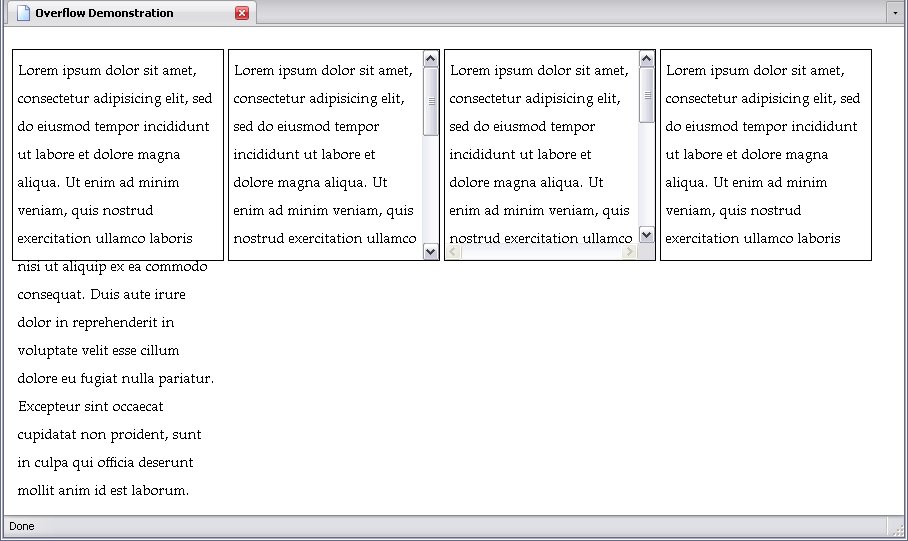
It's not just a vertical scrollbar that shows up, but a horizontal one as well, if required. Do note that some people find horizontal scrollbars very annoying. Below are various paragraphs given both height and width, and displaying the overflow properties. First, the stylesheet:
body{line-height:2;}
p{
border:thin solid black;
height:200px;
width:200px;
padding:5px;
display:inline-block;
vertical-align:top;
}
#p_1{overflow:visible;}
#p_2{overflow:auto;}
#p_3{overflow:scroll;}
#p_4{overflow:hidden;}
And the result:
The second and third paragraph look quite similar, but a closer look reveals that while both paragraphs have vertical scrollbars, the third has an additional inactive horizontal scrollbar as well.
Position
| Property: | position |
|---|
| Default value: | static |
|---|
| Inherited: | No |
|---|
Positioning an element is a means of deciding where it's supposed to go. There are four keywords that decide how an element is positioned:
- static
- relative
- absolute
- fixed
How they each work is quite different, so I'll explain the properties that define an element's actual position first:
- top
- Sets the distance from the top of the element.
- right
- Sets the distance from the right side of the element
- bottom
- Sets the distance from the bottom of the element
- left
- Sets the distance from the left side of the element
If position is set to static, none of the above properties will have any effect.
position:absolute;
For position:absolute;, the element is taken out of the normal flow of elements entirely and positioned according to the properties defined above. This does mean that an absolutely positioned element can overlap with other elements and content.
For position:absolute;, top, left, and right set the the distance between the top, left, or right side of the element (respectively) from the top, left, or right side (respectively again) of the webpage. So, if you have position set to absolute and top to 0, that element will be right at the top of the webpage, and when you scroll down, you soon won't see it anymore.
The bottom property sets the distance between the bottom of the element and the bottom of the viewport before the page is scrolled. When you scroll it, the element moves with the page.
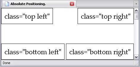
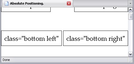
Below is a stylesheet displaying absolute positioning. The 1,000-pixel-high div element is there to make sure the page can be scrolled up and down and contains no text whatsoever.
p{
position:absolute;
border:thin solid black;
margin:0;
padding:10px;
font-size:18pt;
}
div{height:1000px;}
.top{top:0;}
.left{left:0;}
.bottom{bottom:0;}
.right{right:0;}
The result can be seen below. The image on the right shows what happens when you scroll down:
The size of the window does not matter; the elements are always where they are according to the sides of the viewport, which is important to remember when designing a webpage.
One other thing that's important to know about absolute positioning: If you absolutely position the child element of an absolutely positioned element (and you can do this), the position will be calculated from the parent element, rather than from the viewport.
This has several practical applications. One of the more common applications is to make the links in a navigation list line up with a picture.
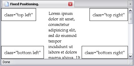
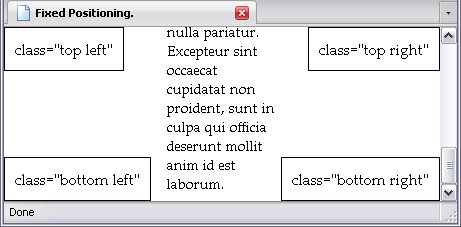
position:fixed;
For position:fixed;, the element is positioned exactly like it is for position:absolute; with one difference: a fixed element doesn't move. To demonstrate this, I've used almost the exact same code I used to demonstrate absolute positioning, but tweaked it a little: I made the font size for the paragraphs smaller, gave the div element a margin instead of a size so it wouldn't overlap with the paragraphs (note: this is a really common trick), and said div element now contains some text. Below is the stylesheet:
p{
position:fixed;
border:thin solid black;
margin:0;
padding:10px;
font-size:18pt;
}
div{margin:0 155px;}
.top{top:0;}
.left{left:0;}
.bottom{bottom:0;}
.right{right:0;}
The result is below. On the right is the result of scrolling down.:
The Lorem Ipsum
text moves, the paragraphs don't.
If you absolutely position the child elements of an element with a fixed position, the child elements will stay where they are according to their positioning with their parent element.
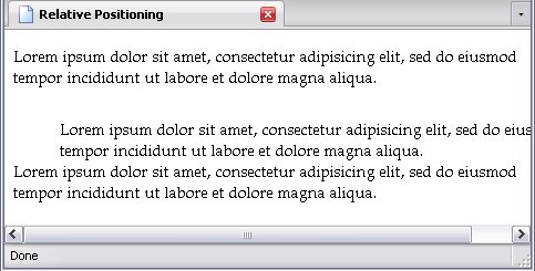
position:relative;
Relative positioning, unlike absolute or fixed positioning, doesn't take an element out of the flow. Instead, it's offset from where it normally would be, and the following elements are placed as if the positioned element was never moved at all.
Below is a stylesheet using relative positioning.
p{position:relative;}
#p_2{
left:3em;
top:1em;
}
And the result, showing the second paragraph offset, but the third almost getting overlapped because it hasn't moved at all. Do note the horizontal scrollbar, because the second paragraph is just as wide as the others, even though it's been moved over.
Float
| Property: | float |
|---|
| Default value: | none |
|---|
| Inherited: | No |
|---|
Floating is a little tricky to describe. Below are the keywords of the float property:
- none
- The element is not floated at all
- left
- The element is floated to the left
- right
- The element is floated to the right
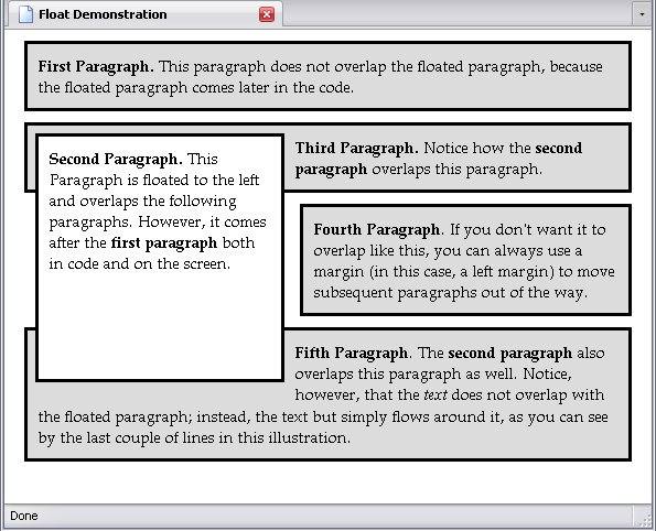
The floated element is not taken out of flow entirely; the content that comes before it in the code comes before it on the page. A floated element is set to either the left or right side of the screen (depending on the keyword you use) and the following content flows around it.
Below is a webpage demonstrating this:
The stylesheet for this page this may look complex, but it really isn't. In fact, in this particular stylesheet, there is not a single property in the following stylesheet that hasn't been covered yet: colour was explained in the chapter dealing with CSS Value Types and Font and Text; padding, margins, and borders were all covered in The CSS Box Model; backgrounds in CSS Backgrounds, and width and height earlier in this chapter. I'll say it again: you've seen it all before.
p{
padding:10px;
border:solid medium black;
margin:10px;
background:rgb(220, 220, 220);
}
#p_2{
float:left;
width:200px;
height:200px;
background:#FFF;
margin-left:20px;
}
#p_4{margin-left:260px;}
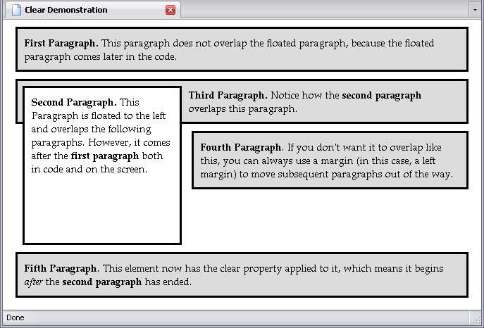
It is important to note that if two adjacent paragraphs are both floated left, right, or one left and one right, they will appear side-by-side.
Clear
| Property: | clear |
|---|
| Default value: | none |
|---|
| Inherited: | No |
|---|
When one or more elements are floated, the clear property explicitly states that the element it is applied to does not flow around the floated element, but is placed below the bottom edge of the floated element. This can be used to create a new row of floated elements, if so desired.
The clear property has the following keywords:
- left
- Clears any elements that are floated to the left, but not those floated to the right.
- right
- Clears any elements that are floated to the right, but not those floated to the left.
- both
- Clears all floated elements
- none
- Does not clear floated elements
To demonstrate the clear property, I created a page with an identical stylesheet as the one used to demonstrate the float property, but added a single rule to affect the fifth paragraph:
Making It All Work
I'd like to turn you all loose and simply let you experiment, but I should also give you an idea of where to begin.
To begin with, absolute and fixed positioning shouldn't be for the main content. Let that remain static. Instead, use it to position stuff like your menus and your page title. Give your static elements margins to keep them from being overlapped.
Floating can be used to put a bunch of block elements in a line, but inline-block elements work just as well.
Lastly, never be afraid to combine positioning, background images, and so on to create the kind of page you want.
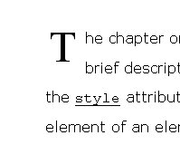
How I Styled The Initial Letter Of This Chapter
I'll share a trick with you right now: namely, how to get the effect with the first letter in each chapter of this very book. In case you're using an older browser and the first letter looks no different from the rest, I'll provide an image of how it looks:
div.chap_intro > p:first-child:first-letter{
display:block;
float:left;
font-size:3em;
line-height:1em;
font-family:"Times New Roman", serif;
padding:10px 10px 5px 5px;
}
div.chap_intro > p:first-child{text-indent:0px;}
div.chap_intro > p:first-child + *{clear:both;}
- Lines 1 - 8:
- The first letter pseudo-element of the first-child
p element of a div element with the class value chap_intro
,
- Line 2
- is a block element,
- Line 3
- floated left,
- Line 4
- is 3 times its inherited size
- Line 5
- Is set to a line-height equal to its own size
- Line 6
- Is set to the
Times New Roman
font family, with a serif
fallback.
- Line 7
- Has 10 pixels of padding on the top and right, and 5 pixels of padding on the bottom and left.
- Line 9
- The first-child
p element of a div element with the class value chap_intro
is not indented.
- Line 10
- Whatever follows the
p element of a div element with the class value chap_intro
clears the float, whether it needs to or not.
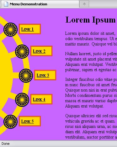
A Specially-Styled Menu
Using a combination of background images, absolute positioning, and overriding the default display, I have created a webpage in which the navigation menu is arranged along an image. A portion of the (admittedly garish) page is shown below:
Now this has a rather long stylesheet—much longer than most of my examples—but when you get into visually rich webpages, though, stylesheets do get pretty lengthy, as you'll see if you look at The Main Stylesheet For This Book. In any case, here's the gist of what happens: The page is given a background colour, the ul element used as a navigation menu is given a background image and has all list styling stripped from it, the li elements are aligned with the background image and given background images of their own, and the a elements are made block elements and given a border and a background. Lastly, the div element containing the content is given a margin so it's not overlapping this thing.
So here's the code:
body{
background-color:rgb(200,100,255);
color:rgb(0,0,0);
}
#Nav{
background:url('./fancy_bg.gif') no-repeat 0 0px;
position:absolute;
list-style-type:none;
height:385px;
width:99px;
top:20px;
left:0;
}
#Nav li{
background:url('./fancy_list_image.gif') no-repeat 0 0;
position:absolute;
height:47px;
width:120px;
}
#Nav a{
background-color:rgb(255,200,0);
border:3px double #f00;
display:block;
height:27px;
line-height:27px;
margin:5px 0 10px 50px;
padding-left:5px;
font-variant:small-caps;
font-weight:bold;
color:#000;
}
#li_1{top:25px; left:10px;}
#li_2{top:95px; left:47px;}
#li_3{top:172px; left:59px;}
#li_4{top:249px; left:47px;}
#li_5{top:319px; left:10px;}
#Content{margin-left:200px;}
<ul id="Nav">
<li id="li_1"><a href="#li_1">Link 1</a></li>
<li id="li_2"><a href="#li_2">Link 2</a></li>
<li id="li_3"><a href="#li_3">Link 3</a></li>
<li id="li_4"><a href="#li_4">Link 4</a></li>
<li id="li_5"><a href="#li_5">Link 5</a></li>
</ul>
The bad news is the CSS is rather lengthy. The good news is that if you use an external stylesheet, you only have to type all that out once. The stuff you do have to type out a zillion times is pretty simple.