The background of the webpage should not be really noticed by the viewer, unless the view is deliberately looking at it. Instead, the background's purpose is to make the website—and therefore its content—more noticeable; if the background is more noticeable than the content—or, worse, makes the text hard to read—its purpose is defeated.
The most common backgrounds are colours, although images may be used as well. Remember when I mentioned CSS URIs in CSS Value Types? This is their most common use.
The background properties are as follows:
- background-color
- background-image
- background-repeat
- background-position
- background-attachment
- background
The last, of course, is the shorthand property.
Background Images
Another option for backgrounds is the image. These can be used in conjunction with background-color.
The Background Image
| Property: | background-image |
|---|
| Default value: | none |
|---|
| Inherited: | No |
|---|
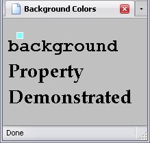
This property sets what image you actually use; the value is the URI of the image. Please remember: when you are using a relative URI, the path will be in relation to the stylesheet, rather than the (X)HTML document.
Below is a stylesheet of an element with a background image.
body{background-image:url('./image.PNG');}
And the result:
How The Background Is Repeated
| Property: | background-repeat |
|---|
| Default value: | repeat |
|---|
| Inherited: | No |
|---|
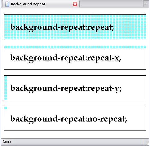
The background-repeat attribute allows you to control how your background image repeats itself. It has the following values:
- repeat
- This will cause the background image to repeat both horizontally and vertically, covering the entire background of the element (as seen above).
- repeat-x
- This will cause the background image to repeat horizontally, but not vertically, creating a row of pictures in the background.
- repeat-y
- This will cause the background image to repeat vertically but not horizontally, creating a column of pictures in the background. Yes, this is the exact opposite of
repeat-x
- no-repeat
- This will cause the background image to appear once and once only.
h1{
background-image:url('./image2.PNG');
padding:20px;
border:1px solid black;
}
#h1_1{background-repeat:repeat;}
#h1_2{background-repeat:repeat-x;}
#h1_3{background-repeat:repeat-y;}
#h1_4{background-repeat:no-repeat;}
Background Image Position
| Property: | background-position |
|---|
| Default value: | 0% 0% (top right) |
|---|
| Inherited: | No |
|---|
The property background-position displays where the background will be. It can be set in a number of ways:
- keywords
- percentage
- length
Now you can use either one or two values for this. If only one value is specified, that is used for horizontal positioning, while the background is centered vertically (with two exceptions, both keywords).
Keywords
There are 5 keywords that set a backgrounds position:
- top
- bottom
- left
- right
- center
The values top and bottom are the centering exceptions I mentioned earlier: If these values are the only values for the background-position property, the background is centered horizontally instead.
The center value can be used for both horizontal and vertical positioning; used as the sole value, it will center the background both horizontally and vertically.
By the way, the values left/right and top/bottom may be written in any order. However, if you are using a number as well as a keyword, left/right should come first and the number second, or the number first and top/bottom second.
Numerically
In numerical positioning, the first number specifies the horizontal position, the second (if present) specifies the vertical position (if absent, the background is centered vertically). Just like in image maps, x and y coördinates come into play.
You may use negative values in this case.
Percentage
This sets the position of your background as a percentage of the width of the containing element.
| Percentage | Horizontal position | Vertical position |
|---|
| 0% | Far left | Top |
| 50% | Center |
| 100% | Far right | Bottom |
You don't need to stick to the above, of course. You may use any percentage you please—even values lower than 0% or higher than 100%, in which case you start moving your background out of the element altogether.
Length
This uses an actual measurement to place the background. I explained length quite thoroughly in the chapter on CSS Value Types, but I will explain a couple of things:
- 0 (of any length) means the left and top
- If you want to put your background on the bottom or right, you need to know the element's height and width, respectively.
- Using lengths to center a background is very unreliable.
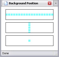
Example Page With Centered Background
div{
background-image:url('./image2.PNG');
padding:20px;
margin:10px;
border:1px solid black;
background-position:50%;
}
#div_1{background-repeat:repeat-x;}
#div_2{background-repeat:repeat-y;}
#div_3{background-repeat:no-repeat;}
Background Image Behavior
| Property: | background-attachment |
|---|
| Default value: | scroll |
|---|
| Inherited: | No |
|---|
This last one controls what the background does when you scroll the page up or down. It has two values:
- scroll
- This means the background moves with the page.
- fixed
- This means the background stays put. This actually bogs down the browser, since it has to remember that the background does not move, while the rest of the page does.
Background Shorthand
| Property: | background |
|---|
| Inherited: | No |
|---|
The background property allows you to set all the above properties in a single declaration.
body{background:silver url('./image2.png') no-repeat 20px 20px scroll;}
Please note that the two position values must be side-by-side, otherwise the browser won't understand the declaration.
Image Rollover Effect
Remember when I said that the :hover pseudo-class could cause an image to change if the mouse cursor were moved over the image? Here's how you do it:
a{
display:block;
height:[height of image];
width:[width of image];
padding:0;
background-repeat:none;
background-position:0 0;
background-image:url('[URI of Image 1]');
}
a:hover{
background-image:url('[URI of Image 2]');}
Because of spotty support for the pseudo-classes in older browsers, it works best with the a element, but you can use the :hover pseudoclass with almost any element.
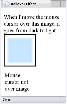
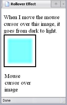
To demonstrate such rollover effects, I've created a page with a blue-coloured square. When I move my mouse cursor over it, the image changes to that of cyan-coloured square.
The page has the following stylesheet:
body{font-size:14pt;}
a{
display:block;
height:100px;
width:100px;
padding:0;
background-repeat:none;
background-position:0 0;
background-image:url('./image-large.PNG');
border:black 3px solid;
}
a:hover{background-image:url('./image2-large.PNG');}
Pretty simple, isn't it? The display, height, and width are all discussed in Arranging The Page, and allows the a element to be displayed as a block element and have the height and width of the image.
One problem with rollover images is that the image may take a moment to download— especially if your page is online. One way is to preload
the images by including them elsewhere in the page but hiding them.
If you think you see a second rollover effect affecting the text following the image, that's because there is one. When I hover the mouse over the a element, it will not only change the background image, but the content of the :after pseudo-element associated with the a element. Here's the code, and it's at the bottom of the style sheet:
a:after{
content:'Mouse cursor not over image';
display:block;
margin-top:100px;
}
a:hover:after{content:'Mouse cursor over image';}
I'll go more into depth on CSS-Generated Content later.
