Entering Data
For a form to function, it has to have a means of receiving input. The input, textarea, and select elements all provide various means of entering that input.
All input elements must be descendants of block elements within the form element.
Common Attributes
- tabindex
- As mentioned in Inline Elements, this sets the order in which the focus jumps from one element to another (in this case, the various input elements) when the tab key is pressed.
- disabled
- This attribute means that the input element cannot be used, and server-side scripts will not read from the input (client-side scripts will, though). It is a boolean attribute and corresponds property
disabled. - onfocus
- The element got the focus of the browser.
- onblur
- The element loses the focus of the bowser.
- onselect
- Some text is selected.
- onchange
- The value is changed.
onfocus, onblur, onselect, and onchange are all events and may be set through client-side scripting.
The Input Element
Element Name: input
The input element is where you enter the information. It must be contained within a block element, such as p or li.
The input element is an empty element. It has no end tag.
Implied Attributes
The following are used in all input elements. Attributes used in specific types are explained in their own sections.
- type
- What type of input is needed (more on this later). The default value is
text
- name
- The name of the input (or set of inputs)
- value
- The default value of the input.
- size
- The size of the input. For most controls, it's measured in pixels, but with text or password inputs, it's measured in characters.
- alt
- A short explanation of the input. Very useful for accessible websites.
- accesskey
- Key used to access the input.
- disabled
- tabindex
- onfocus
- onblur
- onselect
- onchange
- Explained above
Input Types
The attribute type is the most important attribute in an input element. It describes what kind of input it is. The type has the following possible values:
- text
- password
- checkbox
- radio
- button
- reset
- submit*
- file*
- hidden
- image*
* Server-side use only
Every attribute I mention in this section on input elements can be used with any type. However, not all of them will do what is expected. For example, you may use the checked attribute with an input element with type text
. It just won't do any good.
The attribute type corresponds with the property type, and may be changed through JavaScript.
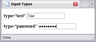
Text and Password Boxes
Both of these are text boxes, but the text inside them is handled differently. In a textbox, it's clear for all to see; in a password box, the text is obscured:
Attributes for Text And Password Boxes
- value
- This attribute sets the default text for the text or password box. Changing this text will change the value of the input.
- readonly
- This attribute means the text in it can't be directly altered by the user. It is a boolean attribute and corresponds with the JavaScript property
readonly. - maxlength
- This numeric attribute sets the maximum number of characters that can be entered into a field. The length of the text field is irrelevant.
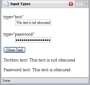
Getting Text From Text And Password Boxes
The text of a textbox or a password box is known as its value. It's this property that you use to get its information.
Below is a simple form and the script used to get its information:
var form = document.Form;var txt = document.getElementById("Text-text").firstChild;var pass = document.getElementById("Pass-text").firstChild;onclick = function(){Write(form.Input[0].value, txt);Write(form.Input[1].value, pass);function Write(box, span){"Null";Notice that I highlighted the contents of the name attributes to show how the form name becomes a property name of the document and the input names become property names of the form; that's what I meant by, In JavaScript, the value of name becomes an property of its respective form element node.
Below is the result:
Checkboxes and Radio Buttons
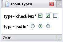
Checkboxes and radio buttons allow for multiple choice. There is one major difference: More than one checkbox can be chosen, but only one radio button may be chosen.
If two or more radio buttons share the same name, only one of those buttons can be checked at any time. Below, I have two groups of radio buttons arranged in columns; one is named G1
, the other G2
.
Three share the name G1
, the other three the name G2
. Therefore, there are two groups and only one from each group can be chosen (two choices in total).
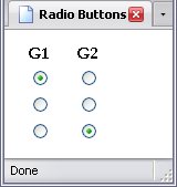
Which is the case.
Attributes for Checkboxes And Radio Buttons
- checked
- This sets the name of what is automatically selected when the page is loaded. If more than one radio button in a single group has this, the last button with this attribute in the group is the one that is checked. If the inputs are checkboxes, then all checkboxes with this attribute are checked. It is a boolean attribute and corresponds with the JavaScript property
checked. - value
- This attribute is a lot more important in these controls than they are in text boxes and passwords. The
valueattribute is a checkbox's or radio button's only means of passing on information beyond whether or not it is checked to the script.
Getting A Value From Radio Buttons And Checkboxes
When you assign the same name to inputs, the name, used as a property, returns an actual node list, which you can then use like an array.
Both types of inputs have a property called checked. If a checkbox or radio button is checked (i.e. selected), the property returns the boolean value true. Otherwise, it returns the value false.
Look at the example below:
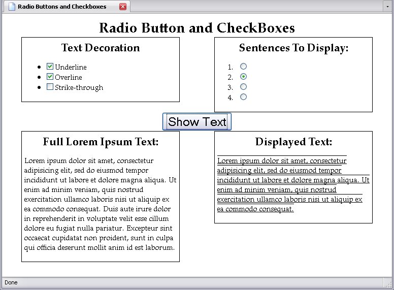
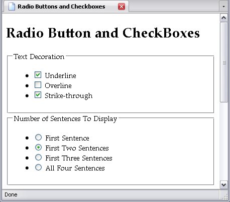
I have one list with checkboxes, and another with radio buttons.
You can't show both 1 and 2 or 2 and 4 sentences, but you can have the letters underlined, overlined, and struck through. Therefore, radio buttons for the number of sentences, and checkboxes for the text decoration.
Below is the full script:
var form = document.Form1;var txt = document.getElementById("Display_Text");var lorem = document.getElementById("Lorem").firstChild.data.split(".");Click.onclick = function(){var sentence = -1;var text = "";var decor = "";do{". ";while(!(form.Sentences[sentence].checked));firstChild.data = text;for(var l = 0; l < form.Decorate.length; l++){if(form.Decorate[l].checked){Decorate[l].value + " ";style.textDecoration = decor;The radio buttons in the Sentences group is handled by a do-while loop.
do{". ";while(!(form.Sentences[sentence].checked));The Lorem Ipsum text is split using the period as a delimiter, resulting in an array of four sentences (lorem). Every time the loop is run (as a do-while loop, it's run at least once), sentence (initially set to negative 1) is incremented by one, the text stored in the slot that corresponds to the variable sentence is added to text, and the while condition keeps everything going so long as the radio button that sentence had corresponded to is not checked.
There's a couple of things I want to point out. First, if no radio buttons in that group were checked, this would technically be an infinite loop (or, rather, would crash when it ran out of nodes), but recall in the HTML, one of the radio buttons has the attribute checked, so even if you don't check a radio button, one will be automatically checked. Second, I omitted the value attribute from the radio buttons— I don't need it. The do-while loop tells the script to keep adding text until it encounters a checked radio button, allowing me to omit value.
Since only one radio button can be checked, the loop doesn't need to run anymore once a checked one is found. Thus, a while loop (or in this case, a variation thereof) is used.
Meanwhile, since any number from none to all checkboxes can be checked, we have to go through all of them. This calls for a for loop, which will check all of them.
for(var l = 0; l < form.Decorate.length; l++){if(form.Decorate[l].checked){Decorate[l].value + " ";This loop thus runs through the node list represented by Decorate, so the if statement checks to see if each one is checked (which, remember, returns a value of true). Each time one is, the variable decor (which starts out empty) is updated, and the final result is later sent to the style property textDecoration. As you know, in CSS the value underline overline strikethrough
is perfectly acceptable, and so it is with JavaScript.
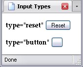
Buttons and Reset Buttons
The last two inputs that are commonly used for client-side scripts are the reset button and the regular button. The reset button simply resets the form to its original state, while the regular button is there for something to click on (for example, if you're running a client-side script).
The value attribute of these alter their text. Normally, a button-type input has no text, and a reset button has simply the word Reset
.
Others
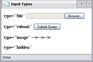
There are four types of inputs that I didn't mention, mostly because they're used with server-side scripting:
- file
- This allows for file input.
- submit
- Submits the form to the server for processing
- image
- An image that works like a submit button. It shows up like an image, but when you click on it, the values passed onto the pages specified in the
actionattribute of theformelement are the x- and y-coördinates of where you clicked on the image. Yes, it works like an server-side image map, as explained in Image Maps. It has the following attributes:- src
- The source of the image.
- usemap
- Use a client-side image map.
- ismap
- Use a server-side image map.
imgelements. - hidden
- This control isn't seen on the webpage, but is often used to contain information that you want to work with.
The Text Area Element
Element Name: textarea
The textarea element is used to contain large amounts of text, and therefore shows multiple lines (as opposed to the input element, which shows only one).
While this attribute does not have a value attribute (though it does have a value property), this is offset by the fact that this is not an empty element, and may therefore contain text. It cannot have other elements nested in it, though, and treats them like the title element does.
Required Attributes
- rows
- How many rows of text to display (i.e. height).
- cols
- How many characters to show per line (i.e. width).
There are other attributes that may be used with the input element, but work best with specific types.
Implied Attributes
- readonly
- This attribute, when present, must have the value
readonly
. It means the text in it can't be directly altered by the user. - tabindex
- Sets the order of tabbing.
While this element does not have a name element, you can identify it by the id element, which will have much the same effect.
Using A Text Area
The text area presents a special challenge because its contents may include new lines, which I explained back in Text.
In the example below, the script takes the text entered into a text area, and writes the first three lines that contain text to three separate p elements. You will see that the id attribute can be used like a property for these elements.
p Elementsvar form = document.getElementById("Form");var txt = form.Text;var write = document.getElementById("Write").getElementsByTagName("p");Click.onclick = function(){var txt_split = (txt.value.match("\r\n"))?txt.value.split("\r\n"):txt.value.split("\n");var l = 0;var pc = 0;while(pc < write.length && l < txt_split.length){if(txt_split[l].length > 0){firstChild.data = txt_split[l];Note the highlighted line. Some browsers see a new line in a text area as a carriage return character (\r
) followed by a new line character (\n
), while others see a new line as simply a new line character. Here, I have set up the script to choose which to split the line on.
The result is below:
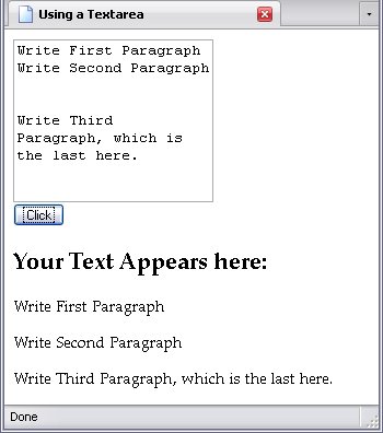
There are several blank lines, but all have a length of 0, which means that the if statement skips them.
Dropdown Menus
Dropdown menus are yet another means of input. These elements come in a specific set. The elements are:
- select
- option
- optgroup
The Select Element
Element Name: select
The select element contains all the options associated with it. This element must be a child of a block element.
Implied Attributes
- size
- This numeric attribute sets how many rows of options are visible. The default is one.
- multiple
- This attribute allows you to make multiple selections rather than just one. It is a boolean attribute.
The Option Element
Element Name: option
The option element is what contains the values that are passed on to the script. Moreover, it is not an empty element, but may contain text, since the contents of the value attribute and the text of the element may indeed differ.
Implied Attributes
- label
- This allows for a shorter label than the option element's content.
- selected
- An
optionelement with this boolean attribute is pre-selected. If there is more than oneoptionelement within the sameselectelement with this attribute, the lastoptionelement with this attribute is preselected. It corresponds with the JavaScript propertyselected. - value
- This contains the information the selected
optionelement (and thus the entireselectelement) passes on to the script.
The Option Group Element
Element Name: optgroup
The optgroup element contains a group of options. This creates a heirarchy in the list of options; useful for organizing a list of options.
Implied Attributes
- label
- This contains the label of the option group.
Using A Dropdown Menu
Below is a page that uses all of these elements:
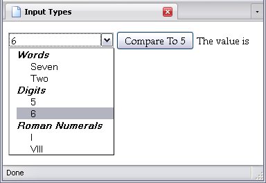
Here is the code of the elements in question:
I could have easily arranged them like this as well, eschewing the optgroup altogether:
optgroup elementsBelow is the script that works with this particular control:
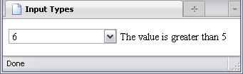
var form = document.getElementById("Form");var txt = document.getElementById("Answer").firstChild;Click.onclick = function(){var ans = Number(form.Selection.value);if(ans > 5){data = "greater than 5";else if(ans < 5){data = "less than 5";else {data = "equal to 5";Below, I select a random option, and click the button for a comparison.
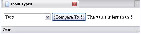
If I want to get rid of the button, and have simply selecting an option do the comparison, a simple change of the code suffices:
var form = document.getElementById("Form");var txt = document.getElementById("Answer").firstChild;Selection.onchange = function(){var ans = Number(form.Selection.value);if(ans > 5){data = "greater than 5";else if(ans < 5){data = "less than 5";else {data = "equal to 5";I set the event to detect a change in Selection's value, and that runs the script instead, which means I can get rid of the button: